
Why Next.js and shadcn/ui Became My Favorite Production UI Combination
A practical reflection on building production interfaces with Next.js and shadcn/ui, from reusable primitives and accessibility to design-system ownership and long-term maintainability.
Over the last month, I have spent a lot of time shaping this Next.js project: building the blog, refining the shared header, keeping the content system simple, and making each page feel like part of the same product.
That experience has made one frontend combination stand out to me: Next.js with shadcn/ui.
There are many excellent UI libraries. A traditional library can help a team move quickly, especially when it provides a large catalogue of ready-made components. But shadcn/ui gives me something I value more as an application grows: the component code belongs to the project.
Next.js gives the application a strong runtime and routing foundation. shadcn/ui gives the interface a practical set of accessible building blocks without hiding the implementation behind a package boundary. Together, they create a workflow that feels fast at the beginning and still leaves room for product-specific decisions later.
The idea in one sentence
The combination works well because it separates two responsibilities clearly:
- Next.js organizes the application through routes, layouts, server and client boundaries, data loading, metadata, and deployment.
- shadcn/ui helps us build the interface from source-owned primitives that can be composed, themed, and extended.
The official shadcn/ui documentation describes it as a code distribution platform rather than a traditional component library. That distinction is important. When a component is added, we receive source code that we can understand and adapt instead of treating the component as a sealed dependency.
What I learned from this project
This project does not need a huge design system to be useful. It needs a small number of patterns that remain consistent:
- a shared site header
- predictable page spacing
- readable cards and links
- clear navigation between the blog list and individual posts
- responsive layouts that work on smaller screens
- a content structure that is easy to extend
The important lesson is that consistency is not created by adding more components. It is created by defining a few good primitives and reusing them deliberately.
That is where shadcn/ui fits my way of working. I can start with a polished button, card, dialog, input, or navigation pattern, and then make it match the product instead of fighting an opaque API.
Why Next.js is a strong foundation for production UI
The App Router gives us useful boundaries for a production application. Pages and layouts are Server Components by default, while interactive controls can be isolated in Client Components when they need state, event handlers, effects, or browser APIs.
That separation gives the UI a more intentional shape:
route and data loading
        |
        v
server-rendered page shell
        |
        +--> source-owned UI primitives
        |          |
        |          +--> interactive Client Components
        |
        +--> loading, error, and empty states
For example, a blog post page can remain mostly server-rendered while a small menu, search field, or theme control becomes interactive at the leaf where it is needed. This keeps the client boundary narrow instead of turning the entire page into one large client bundle.
Next.js also gives the application a natural home for production concerns such as nested layouts, route-level loading states, metadata, image optimization, and server-side data access. The UI library should support those boundaries, not erase them.
What makes shadcn/ui different from a normal UI library
The difference is ownership.
With a traditional package-based library, the usual workflow looks like this:
- install the package
- import a component
- pass props and class names
- add wrappers when the component does not quite fit
- override styles when the design system disagrees with the defaults
That model is convenient, but deep customization can become expensive. The team may end up with wrapper components, override layers, and several conventions for doing almost the same thing.
With shadcn/ui, the workflow is closer to this:
- use the CLI to distribute a component into the project
- read the implementation
- compose it into a domain component
- add product-specific variants when they are genuinely needed
- keep the source under the same review and testing process as the rest of the application
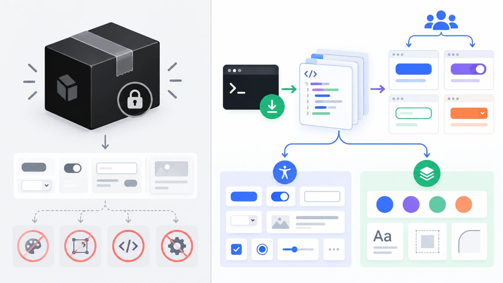
This does not mean shadcn/ui removes maintenance. It moves maintenance into a place where the team has visibility and control.
Start with primitives, finish with product components
One of the most useful habits is to keep the layers separate.
Layer one: UI primitives
These are the small reusable building blocks:
ButtonInputCardDialogDropdownMenuBadgeTableSkeleton
A primitive should solve a repeated interface problem. It should not know what a particular business feature means.
Layer two: shared patterns
Shared patterns combine primitives into a repeatable experience:
- a filter bar
- a confirmation dialog
- a responsive navigation menu
- a post preview card
- an empty state
- a form field with validation feedback
Layer three: domain components
Domain components express the product language:
BlogPostCardDeploymentStatusProjectOverviewArticleTableOfContents
This layering keeps the base components reusable while allowing the actual product to have a distinct identity.
A small component example
The normal usage stays familiar because the component API is intentionally composable:
import { Button } from "@/components/ui/button"

export function PublishAction() {
  return (
    <Button variant="default" size="lg">
      Publish post
    </Button>
  )
}
The important part is not the button markup. The important part is that the team can open the local button.tsx file when the product needs a new variant, a different focus treatment, or a stronger loading state.
That is a very different experience from searching through a large dependency to discover which internal selector or theme override is required.
1: extend variants instead of scattering styles
Production applications usually need more than primary and secondary. They may need a destructive action, a quiet text action, or a visually strong call to action for a particular product surface.
The clean approach is to extend a component’s variant contract in one place. With class-variance-authority, a button can have named variants that remain discoverable and type-safe:
const buttonVariants = cva("...base styles...", {
  variants: {
    variant: {
      default: "...",
      outline: "...",
      destructive: "...",
      quiet: "...product-specific styles...",
    },
  },
})
Then feature code communicates intent:
<Button variant="quiet">Read later</Button>
This is better than repeating long utility strings across pages. If the visual language changes, the shared variant changes with it.
2: use design tokens for the whole product
The best customization is not a collection of one-off colors. It is a token system.
A project can define semantic values such as:
- background and foreground
- card and popover surfaces
- primary and secondary actions
- muted text
- borders and focus rings
- destructive states
Components consume those semantic tokens instead of hard-coding a specific blue or gray in every file. This makes light and dark themes, brand refreshes, and accessibility adjustments much easier to manage.
In this project, the same principle is visible in the shared layout: the header, blog cards, article content, and navigation should feel related even though they are used by different routes. A token-first approach helps us preserve that relationship as more pages are added.
3: compose accessible interactions
Production UI is not just a visual screenshot. It must work with a keyboard, a screen reader, different viewport sizes, slow networks, and imperfect input.
shadcn/ui commonly builds on accessible primitives such as Radix UI. That gives us useful behavior for interactions like dialogs, menus, tabs, and popovers, while the source-owned layer lets us adapt the visual treatment.
For every interactive component, I check:
- Can I reach it with the keyboard?
- Is the focused element visible?
- Does the control have an accessible name?
- Does a dialog have a meaningful title?
- Is the disabled or loading state communicated without color alone?
- Does the mobile layout remain usable?
Starting from an accessible primitive saves time, but it does not replace testing the assembled feature.
4: keep forms predictable
Forms often expose the difference between a demo UI and a production UI. They need labels, validation, errors, disabled states, pending states, and good keyboard behavior.
A practical form structure might look like this:
<FieldGroup>
  <Field data-invalid={hasError}>
    <FieldLabel htmlFor="email">Email address</FieldLabel>
    <Input id="email" aria-invalid={hasError} />
    {hasError ? (
      <FieldError>Please enter a valid email address.</FieldError>
    ) : null}
  </Field>
</FieldGroup>
The exact components depend on the project’s configured shadcn/ui version and base primitives, but the design principle remains stable: keep labels, validation, and state communication part of the component composition instead of adding them as an afterthought.
Enhancement capability five: make loading and empty states first-class
A production page has more than a successful state. It also has:
- loading
- empty
- error
- unauthorized
- partially available data
- retrying or submitting
The combination of Next.js route-level loading and shadcn/ui primitives such as Skeleton, Alert, Empty, and Spinner makes those states easier to design alongside the happy path.
For the blog, that means the list, article view, navigation, and asset loading behavior should remain understandable even when content is missing or a route is being generated. The same approach scales to dashboards and authenticated product screens.
The production architecture I prefer
The stack becomes most useful when every layer has a clear responsibility:
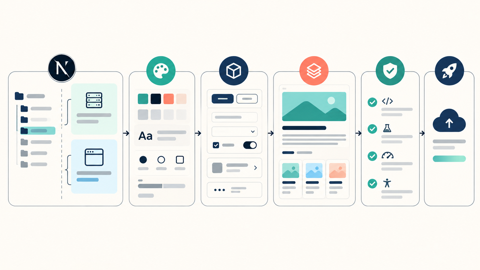
- Next.js route layer: layouts, pages, metadata, loading, errors, and data boundaries.
- Design token layer: semantic colors, spacing, radii, typography, and motion decisions.
- Primitive layer: buttons, fields, dialogs, menus, cards, tables, and feedback components.
- Composition layer: feature patterns that combine primitives into useful workflows.
- Domain layer: product-specific components and business rules.
- Verification layer: accessibility checks, responsive checks, tests, linting, and production builds.
This gives the team a place to make changes without turning every screen into a special case.
Where the Next.js boundary matters
It is tempting to mark a large section of the application as a Client Component because one nested control needs interactivity. That often makes the UI heavier than necessary.
My rule is to keep the boundary as close as possible to the interaction:
// app/blog/page.tsx - server-rendered page
import { FilterButton } from "@/components/blog/filter-button"
import { BlogGrid } from "@/components/blog/blog-grid"

export default async function BlogPage() {
  const posts = await getPosts()

  return (
    <main>
      <FilterButton />
      <BlogGrid posts={posts} />
    </main>
  )
}
FilterButton can be a Client Component if it needs browser state, while the page and its data loading can remain on the server. This keeps the product architecture understandable and gives performance work a clear starting point.
A practical workflow for adding a new feature
When I add a new page or workflow, I use a sequence like this:
- define the user action and the states it can have
- check whether an existing primitive already solves part of the problem
- compose the primitive into a small shared pattern
- keep data fetching and server-only work in the Next.js server boundary
- add interactivity only to the leaf that needs it
- add loading, error, empty, and disabled states
- check keyboard and responsive behavior
- run lint and a production build before calling the feature complete
This workflow is simple, but it prevents the UI from becoming a pile of duplicated one-off markup.
The tradeoffs are real
I enjoy shadcn/ui, but it is not a magic solution and it is not automatically the right choice for every team.
You own the code
That is the main benefit, but it also means you own bug fixes, local conventions, and updates. The team should review copied components just like any other source file.
You need design discipline
It is easy to add many components and still end up with an inconsistent product. A small token system and a clear component layering strategy matter more than the number of items in the registry.
Upgrades are more deliberate
A package upgrade may be one command with a traditional library. With source-owned components, upstream changes need to be reviewed and merged into local decisions. That extra work is worthwhile when customization and control matter, but it should be acknowledged.
It does not replace product design
Good defaults accelerate implementation. They do not decide the information hierarchy, user journey, content, or interaction model for us.
My current recommendation
For a new production Next.js application, I would start with:
- a small token system
- a focused set of shadcn/ui primitives
- server-rendered routes by default
- small Client Components for real interactions
- shared feature patterns before feature-specific exceptions
- accessibility and responsive checks as part of development
- a build and deployment check before publishing
I would avoid adding every available component on day one. Add what the product needs, understand the source, and create a local rule for how new components should be composed.
Final takeaway
The reason I enjoy Next.js with shadcn/ui is not simply that the screens look good quickly. The combination gives me a healthy balance:
- Next.js provides the application structure and server-first runtime.
- shadcn/ui provides polished, accessible starting points.
- The project keeps ownership of the component implementation.
- The team can evolve the design system without waiting for a library API to catch up.
- Production concerns remain visible instead of being hidden behind a large abstraction.
After working through the UI and content architecture of this project, that last point matters the most. The best component system is not the one with the most components. It is the one that helps the team move quickly while keeping the product understandable six months later.